Magical flowers
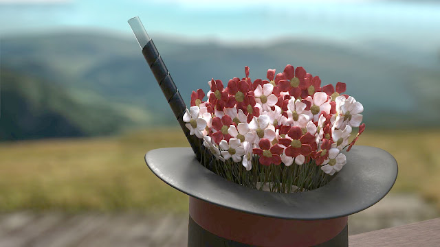
Why magical, you ask? Well, before you can look at them safely you have to perform a magic trick. Let me demonstrate. As you are watching the render, take a few steps back. No, a bit more than that. Yes, that should do it. Now, turn your head to one side... yes, you've got it... squint your eyes a bit, just like that... and voilà, it suddenly looks like flowers! Pretty neat trick, isn't it?
Tl;dr: Flower petals are really hard to get right. Even if you are aiming for a "dried arrangement" look.
I decided to do another nature scene because, well, I quite enjoy making them. I'm not terribly good at it, but that should improve with experience, I hope. Anyway, this week's inspiration came to me after seeing this image. And it was accompanied by plenty others (in fact my Pinterest board now houses more nature scenes than I can hope to ruin process in months to come) so it's likely that this is going to be my theme for a bit longer.
I was particularly interested in trying to texture the flowers in Substance Painter. I wanted to see if I could beat my old nemesis, Subsurface Scattering. As it turns out, the old rascal is still a few steps ahead of me. I downloaded a particular shader that should support SSS, but I'm not entirely sure that I managed to set up everything correctly. And since the effect is not that visible unless you shine light right throw the object, I may never know.
I did my best to include colour variations to spice up the petals a bit, but in the end, their unnatural look comes down to the mesh itself. The good thing is that this time I managed to think ahead and I avoided a lot of rework. I modelled one petal from a plane, copied it four times (with adjustments) and then added the Solidify modifier. The problem was its width. I ended up using half a millimetre, but that's probably still too thick for an actual petal. I did have to have some width because Substance doesn't handle plane-like objects very well.
When I had the five petals ready, I had to apply the Solidify modifier so that I could UV unwrap them. It's always a good idea to do that before you start duplicating things (as the angry past me could verily testify). Then I modelled a simple flower centre and joined everything together. Four more duplicates later, I started moving things around in sculpt mode. It's so much easier and faster than doing that in Edit mode, but it has its limits (you can't rotate things, for instance, and you have to be careful not to skew anything. We are dealing with really narrow objects here, remember).
After that I started several test projects in Substance to see if I was able to use the flower meshes at all. That always involves a lot of bland tweaking, so I'm not going to go into great detail here. In fact, I think I'll jump right to the post-processing part, because that's where most of the magic happened this week.
The Iray renderer is really cool but it doesn't let you blur the background. It can do that in the viewport, but the option is disabled once you start rendering it properly. So I knew I needed to separate the hat with flowers as cleanly as possible in Krita. I spent a lot of time experimenting with manual selection of the area (complicated, gave poor results) and with solid-colour rendering and colour-filtering (slightly better, but gave tinted reflections on the objects themselves).
By a coincidence I found out that when I render the image normally and save it as png, the image I open in Krita looks... odd. It's somehow related to the alpha channel, but that's as much as I know about it. The important part is that Krita has a beautiful feature that lets you separate the png into channels (red, green, blue, and alpha). Which allowed me to turn the alpha channel into a selection mask, apply it to a regular jpg and isolate the front objects cleanly.
And then the hunt began. Hunt for a perfect background. I didn't think it would be that difficult to find one, but... yeah. They were either too bland, or too busy. In the end I settled for this one, did a lot of colour correction and level adjustments on it (seriously, I abused the colours in this one more than I'd ever done before). And when I got to the point where you can no longer see if the adjustments make things better or worse, I called it a final image. But if you are curious, here is the comparison between raw render and the final one:
Next week, it's probably going to be more of the same. Not flowers, no, but something in the outdoor-ish vein. See you next time!


Comments
Post a Comment