An overgrown pond
After a month spent among man-made metal machines, it is hardly surprising that I needed a change of environment. And since I needed the change really desperately, I went as far away as I possibly could. Until I stumbled upon this overgrown frog pond. With no frogs in sight.
As it is usually the case with projects like these, the original idea was quite different from the end result. You see, I did want to brush up on my half-forgotten hastily-learned animation basics and I did want to make an animation. Of a frog jumping around a pond, then on a leaf floating in the middle of it and then into the depths of the pond. While it's raining.
OK, fine, you can stop laughing now. It was meant to be a two-week project, alright? And the idea is not entirely my fault because I was inspired by this video which uses dynamic paint to simulate the rain. Alas, it was not meant to be. The very simple reason being that I would start collecting my pension long before I finished rendering the whole thing. So I decided to create a still image and patiently wait for Blender 2.8 to come out in its full glory.
(Pssst! Do you want to see the original blockout? But only if you promise not to laugh again. You sure?)
Beautiful, isn't it? My drawing skills are far worse than my Blender skills (not that you could tell from that image) so I decided for a quick block-out of the scene. Oh, and just to be sure, the blob in the bottom-left corner is the frog. Yes, really.
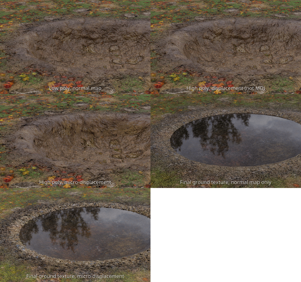
With the rough sketch in mind I started to paint the terrain. If I'm not too mistaken, this is the first time I attempted to actually hand-paint things, rather than put them together procedurally. When I had an early concept, I exported the textures to Blender to see whether I wanted to use a normal map, or micro-displacement. (At this stage I still had an animation in mind, so normal map would have been preferable due to the shorter rendering time.) Here is a short gif of a comparison I made.
I can't remember from the top of my head how many materials I used while painting the ground, but 8-ish sounds about right. And still, you can see that the variation isn't all that great. But I knew that I was going to have several layers of stuff on top of this, so I tried not to worry too much about it.
The next step was the rocks. I added a cube with SubSurf on it, duplicated it three times, and shaped all four meshes with sculpting (with dyntopo disabled). Then I added a Multires modifier to each rock and sculpted it a bit more. The rocks share a single UV space and I wanted to bake the normal map from Multires (using Blender internal). However, for whatever reason, the result had visible seam-like artefacts (even though the normal map looked fine). So I ended up creating two sets of stones, low and high poly, exporting each set in its fbx file, and baking the normal map in Substance Painter. Then I added a simple stone texture with mud and algae-like details, and I exported the texture set for use in Blender.
Once there, I created three versions of the rock material, with each using a different colour ramp and sourcing the particular variation colour from the random input. As a result, each of the 4 (or, actually now 12) stones has a slightly different version of the texture. Here is another gif, probably showing the process better than I just described.
I didn't feel that one needed annotating, but I should perhaps explain the first image. The white rocks were a result of my over-enthusiastic application of the RGB curves node. You can also notice that the particle system placement needed a lot of tweaking, because it stubbornly favoured one type of rock. The most recognisable one, of course.
In the last image you could also see first hints of grass. At this point, the rendering time started to be a bit longer than what I found convenient, so I stopped rendering the rocks and water for a while and simplified the ground. I still ended up waiting over a minute for a 50% down-sized render. But I trudged on. Here is the final bit, showing the grass and plant evolution.
 |
| Made with GrassEssentials and plant textures from Textures.com |
If you were extra perceptive, you might have noticed that I changed the HDR mid-way through. That happened when I definitively realised that this was not going to be an animation, and I therefore no longer needed an overcast sky. I have to say, though, that I'm not terribly happy with the lighting arrangement I came up with. I feel I could have done more in that department, but I just didn't find anything that looked better than this. Perhaps next time.
Speaking of which, it's become a sort of a tradition that I have no clue what I'll be doing next. So I won't even pretend to give you options for what to expect next. It will be a surprise for all of us. See you next time!


Comments
Post a Comment