Lonely tree
This week's render might be the last one in my nature mini-series. Maybe. I'm strongly considering joining a re-run of the beginner's class at CG Cookie. Not because of the techniques showcased but because we should be using Blender 2.8 alpha. And I'd like to hop on the bandwagon rather sooner than later. With that said, I'd prefer to do the homework exercises in addition to my regular weekly scenes. Not sure I'll manage that though, so I'm not going to make any promises at this stage.
But enough jabbering, let's jump straight to the scene breakdown.
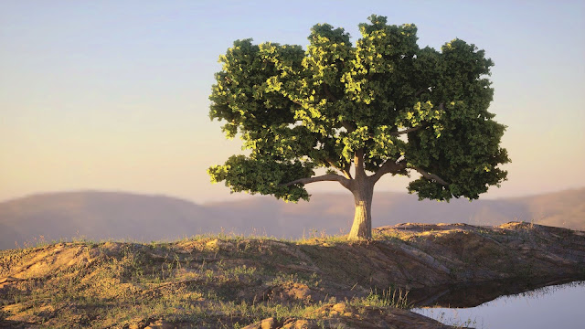
I was watching AgenZasBrothers' Movie Scene Creation recently and I decided it was time to try my hand at creating a tree. They make a really good job of explaining the process step by step so I won't go into a great detail here—watch part 10 if you want tips and tricks on how to go about it. I'll just mention a couple of point here.
One, I thought it would be a good idea to follow the advice repeated by many senior and well-respected artists: make a concept first.
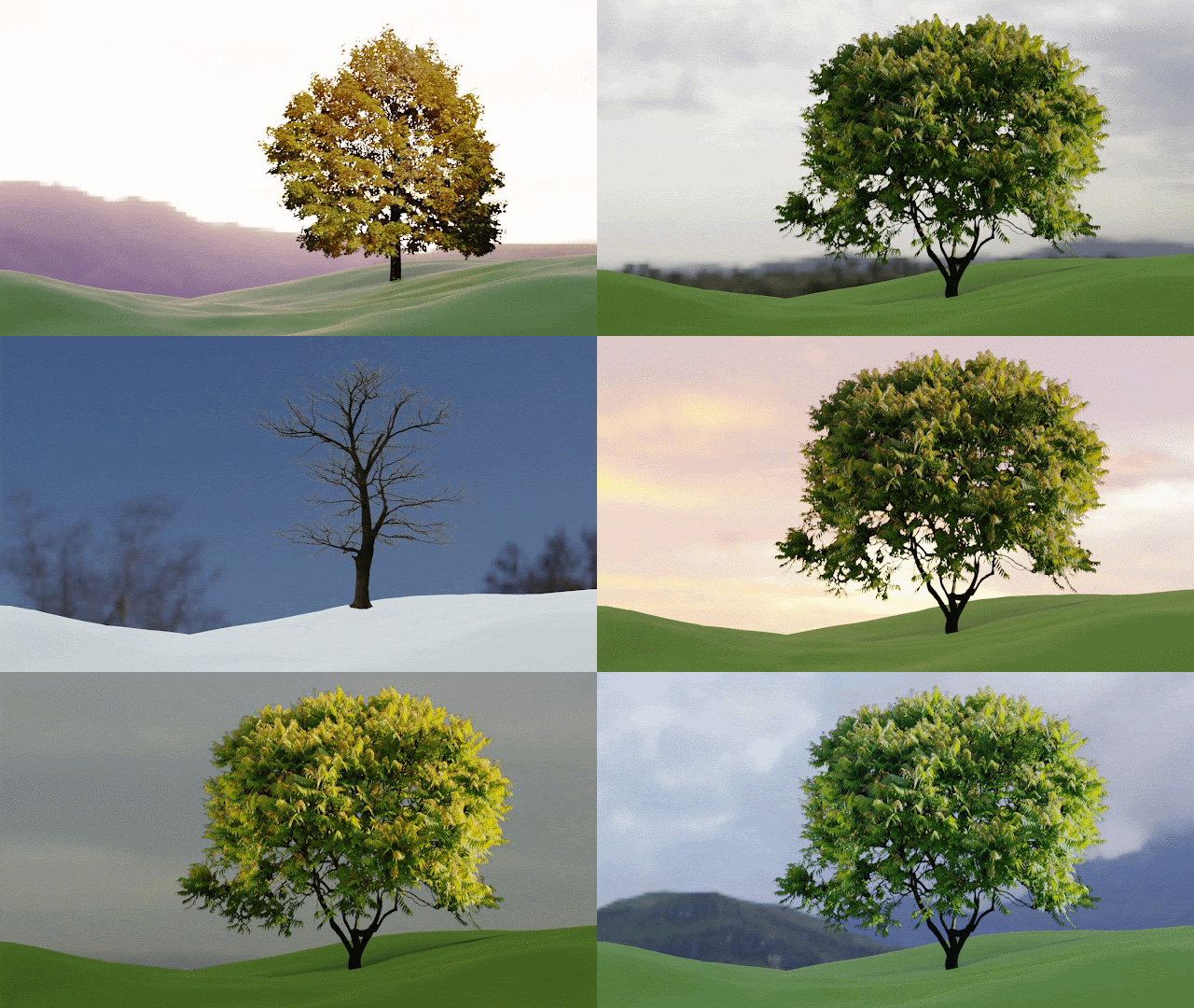
 |
| The seven |
I did. In fact, I made several different ones, using simple objects in Blender and playing with several HDRs. And then in the end I scratched all of that preparation and used a different scene setup. But I suppose that's exactly how it goes for other people, so no problem there.
I'm on my way of becoming a senior, well-respected artist! (Or not.)
Anyway, with a rough idea in mind, I opened a new .blend file and created the tree, the branches and the leaves. I cheated a bit with the last one and I downloaded an image of leaves from Pixabay, alpha-masked it and used it in place of properly-modelled leaves. The pros of doing that were a lower poly count and easier manipulation. The cons were the texture itself and less control of the leaves' rotation. I still subdivided the plane into 6 faces so that it wasn't completely flat, but it does show. Also the absence of SSS is a thing, although it might not be that bad. The image itself showed a fair bit of translucency, so I think it was a good approximation.
 |
| Early test of the particle system |
The second thing I wanted to mention was my personal breakthrough in linking objects into a scene. You might remember that I tried that once before in the attic scene and it didn't go all that great. This time I was prepared. I came across an older but still very relevant tutorial from Aidy Burrows on Linking and appending that cleared up one crucial point for me. You see, when I used the functionality before, I linked an object directly, which gave me no control over its movement and scale. But, if I put the object into its own group, and then link that, the group comes with an empty included free of charge, which can be moved, scaled and rotated with no issues.
I also got myself the nice "Edit Linked Library" add-on that gives you the option to go directly to the source file, where you can make your changes and have them automatically saved when you one-click yourself back into the target file. It just has one issue, as I was quick to find out. Let's say that your source file is called "Oak tree 01.blend" and you link this file into your scene that's called "Lonely tree 01". You realize you want to make changes to the oak tree, so you go there, do your stuff, save the file—and it doesn't show in your scene. Luckily, I was able to figure this one on my own.
If you go to the Outliner and switch the view to "Blender file", you can see all the assets that live in your current scene. Including the linked "Oak tree" file. My issue was that I wanted to be extra safe and I versioned my tree file. Nothing wrong with that, but the link was pointing to v01 instead of v02. That's an easy fix. Just right-click on the linked filename, select "Relocate" and choose the correct version. I know it's not a great deal but I was quite proud of myself for figuring something out on my own, for once.
From there, it was just the usual nerve-wracking chase of perfect lighting, mood, and colours. The materials I created in Substance Painter showed up very differently in Blender (probably due to different lighting) so I had to make up for it quite heavily in post-processing. I'd likely have got even better results if I'd been able to render it in Iray, but that's always out of question when grass is involved.
So, there you have it, yet another outdoor scene. Let's see what the next week brings along. I expect I'll have all sorts of weird things happening to me with 2.8, so don't be alarmed if there are parts of the text bleeped out. See you next time!


Comments
Post a Comment