Tropical island
Surprise! Yes, that's what I've been working on: a tropical island. And the temperature outside is rising. What a coincidence! No, really, I didn't know what to model this time — as you have probably guessed because you are a smart bunch — so I let myself be inspired by the nature. And Lars Mezaka. Whom I admire the most when it comes to creating low poly scenes. Some time ago he did a video on creating a tropical island and when I saw it I thought I'd give it a go. And contrary to the motto of this blog, it went surprisingly well.
I started off creating the island itself. Just a simple plane with a bit of elevation, nothing fancy. Choosing the right colors was crucial, though, so I spent a fair amount of time fiddling with the grass and sand materials. Also, the faces of the grass area needed a bit of adjusting so that the hill did not have jagged edges.
With the island created, I added another plane for the water area (which is a neat trick and I would have had hard time figuring it out on my own). The plane makes it so that only the island area is visible and it is nice and round. It created some problems for me later on but I'll talk more about it in due course.
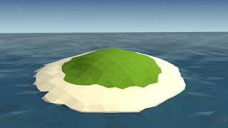
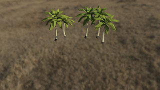
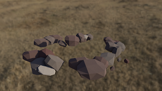
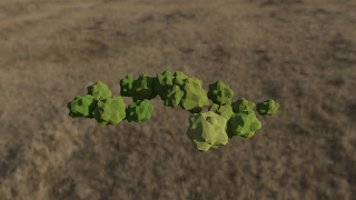
Now, there are many objects placed on the island. Palm trees, rocks, bushes... To make some sense of it all, I started using layers. I had heard about them before but I thought they would be cumbersome to use. However, they proved to be extremely useful. To illustrate how they work, here are the layers rendered separately:
By the way, if you are wondering about the background in images 2 — 4, that's an HDRI texture that is used as one of the lighting sources for the scene. Makes it look more realistic and stuff. I used one of the lower resolution variants because I thought a higher one would be a bit of an overkill for a scene like this.
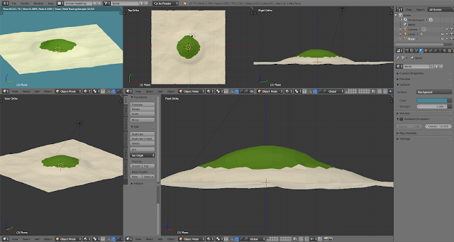
Since I've shown you the layers, I might as well talk a bit about the actual objects inside them. The palm trees are the most intricate ones — them having three separate bits and all. What made modelling them a lot easier, however, was me using a homemade hand-crafted amazingly tailored... layout. It allowed me to see objects from several sides at once. Apart from making Picasso seriously jealous, it prevented me from making the worst of my modelling mistakes where I would work on an object for half an hour only to find out that I had screwed something up within the first fifteen seconds. Having praised it this much, you must be dying to check it out for yourselves. Here you go, then:
Really neat, isn't it? But I digress. Palm trees! Made of roots, trunk, leaves and that weird coconut area that holds the leaves together and I have no idea what to call it. All of it extruded from a cube, apart from the leaves that had their own special cube and then they replicated. Er, duplicated themselves, until there was a whole bunch of them and they looked all leafy.
One issue I did run into, and for a long time I couldn't figure out what happened. As I was finishing up the first leaf, I noticed that a small section of one of its faces looked as if something else was sticking out of it. A tiny inset face if you will. It didn't make any sense to me: there were two parallel sets of faces and there was no way they could intersect each other. But I thought that maybe they were too close and Blender had issues calculating their position or something. So I started fiddling about with individual vertices, which, to my increasing frustration, only made it worse. Just as I was about to give up and delete the leaf I noticed that there were in fact *two* leaves in the outliner. And sure enough, the protruding faces came from two objects being laid on top of each other. I must have duplicated the leaf prematurely and then I didn't go far enough with the "revert changes" action. This is a really common mistake to make and I should have known better by now but... oh well. On to the rocks.
Their design is very simple: just a cube with a few cuts, arranged so that it looks less boxy. But the key ingredient in placing them in the scene is randomness. Of everything. Size, rotation, colour... you name it. Luckily enough for me, Blender has just the right tools for this. The first one is called "Proportional editing: Random falloff". Which sounds like a post-apocalyptic movie I would definitely not watch. What it does in Blender, however, is to take all the objects within the specified radius and apply to them whatever action you happen to be doing, only in an unpredictable manner. So I assume somewhere in the scene one of the rocks has become self-aware and is currently leading a rich intellectual life.
The second tool that helps with randomizing color, specifically, is the node editor. Two of its nodes, actually: MixRGB and Object Info. If you plug them inside each other, you can specify two colors as boundaries and Blender will randomly generate a colour that is somewhere between these two. Which is exactly what you want to do when creating a natural-looking scene. I liked this feature so much that I used it on the palm leaves and the bushes.
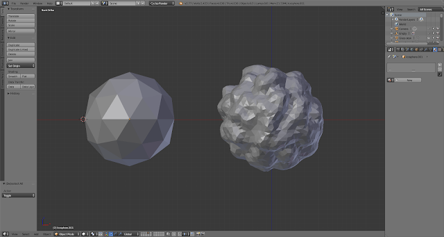
Oh, the bushes. That reminds me that I should mention a new Blender mode that I played with — the sculpt mode. As you can see below, it does exactly what you would expect it to do. Pick an object, add blobs of matter and voilà: a bush. Take five, by the way. The first four attempts were rubbish. I believe the one bellow is take two.
As it turns out, it does not do *everything* what you would expect. For instance, the size of the blob you add or remove is dictated by the distance from the object. Intuitive, I hear you say. Well, not for me.
But we are now getting to the final touches. On which I naturally spent most of the time. The thing was, I wanted to make the water look like, well, water. The way Lars did it in his scene was not quite working for me, so I tried to find my own way. And I eventually stumbled upon something that I'm quite happy with. I used a glossy-transparent plane to simulate the see-through quality of water, and I painted the ocean floor in randomized shades of blue. Also, the upper plane uses fractal displacement to simulate the waves. It worked so nicely from the get-go that I only had to make minor adjustments in the front area to create more waves.
The biggest problem I had in this phase was to adjust the beach so that it didn't have jagged edges — exactly what I did back at the beginning with the grassy hill. But since I hadn't thought about this earlier, it was a real pain to do, and it is still not perfect. If you scroll up to the first layer rendered separately, you can see that the left side of the island has uneven edges where the beach touches the ocean. In the final render they are covered up by rocks, which is why I only noticed them as I was rendering materials for this post. As you can see there is still a plenty of things for me to master.
As for the next time, I won't lie to you, I don't know what to create yet. Again. I have one silly idea in mind, but I don't know if I want to go ahead with it. We'll have to wait and see.


Comments
Post a Comment