Low poly animals
Testing... testing... 1 — 2 — 3... Can you hear me ok?
Wonderful. Welcome to my first real-time (or, rather, one-week-old time) Blender project commentary. I assume you are all dying to know what I've been working on this week. Well, since you ask so nicely — low poly animals, of course. I had this vision on my way to work... No, no, stay with me, I'm not crazy, I swear! I saw this — scene — in my head, where animals were fighting each other, and it was all dramatic and stuff. So I thought I'd do that. You won't see the scene itself this week, because there is a lot of concepts I have to learn first, but I'll show you two thirds of animals I'm going to use. Two out of three, not two thirds of each animal, you sickos!
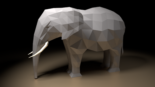
And here comes the first one: ta-daa! For those who can't tell, it's an elephant. It should be an African elephant, specifically, but as long as you don't take it for a giant anteater, I'll be happy.
The thing that helped me the most when I first started working on it, was this tutorial by Grant Abbitt. Nice and short, cuts right to the chase, exactly how I like it. However, Grant made the modelling look far easier than it proved to be. For a start, I spent quite some time on extruding the plane properly. I used a nice side view of an elephant as my reference image, I shaped the plane so that it resembled its body, and then I started extruding it inwards. Er, outwards. Hmm. I needed the center part to stay at the center so that my mirror modifier would work properly, and I also knew that the part of the plane I had selected I should delete afterwards. But no matter how much I tried to make it work, it just wouldn't. In the end, I had to select the other side and delete it, before it started to resemble the tutorial.
And this turned out to be the easiest part.
I modelled the front leg. But of course I extruded it from a wrong face, so I needed to reset everything and start again. Then I extruded it from a correct face, but I forgot to make a loop cut beforehand, so the front legs were connected because of the mirror. You'd think I'd avoid the pitfalls he explicitly mentioned, but noo, jump right in. Plenty of space down here.
The hind leg was even more hilarious. It is wider at the top than the front one, so I had to decide whether I wanted to extrude from one large face and have an uneven topology of the body, or whether I wanted to use two faces for the extrusion. The more sensible solution is the second one, so you can naturally guess what I went with. Caused a lot of trouble later on but that shouldn't really surprise anyone at this point.
I modelled the trunk (and failed to make it the right shape), then I did the tail (which completely screwed up the elephant's bottom), and then I was ready to shape the elephant from the front view. Which is where it all fell apart, really. It must be the "artistic element" that I'm missing. That, and being able to select vertices properly. Because there is nothing better than having spent half an hour on modelling something, only to realize that you didn't select an essential part of the mesh at some point, and now it's all a big mess. If someone analyzed the shortcuts I use the most, Ctrl+Z would be so far ahead of the other ones that it would be pointless to even mention them.
As the post is already getting longer than it has any rights to be, I won't bang on about modelling the tusks and ears; I'll just content myself with saying that any part of a mesh that sticks out is a bloody nuisance. I never know whether I should move the faces or rotate them, so I usually end up with a tangled mess of vertices, and the only way of sorting them out is deleting them and replacing them with hand-crafted faces. Which is as good as throwing out your topology out of the window.
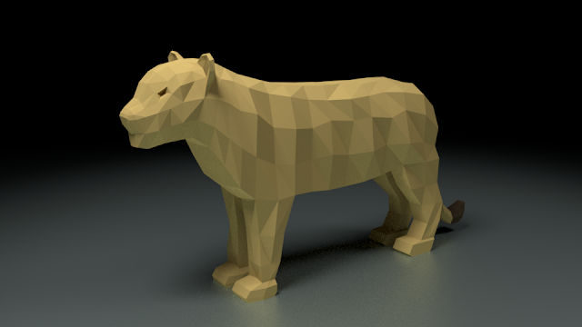
Before I talk about the scene setup, I'll show you the other animal I created. A mighty lion...ess. I did originally think I'd create a lion but then I realized that it is the lionesses who hunt, which is what I need for my scene to work. So a lioness it is. Should be a bit easier without the mane, I think. (Heh, sure.)
Since I created this with the same technique, it did go a bit better. At least initially. I modelled the whole body from side view fairly quickly but then I struggled with the front / top view again. I even found some decent reference images but the problem with a front view is that everything is aligned so that you can't see the shape very well. Then I had a brilliant idea to use a top view. Surprisingly few people photograph lions from the top view. In the end, the only image I could find was an anatomical drawing of lion's muscles. That should do, I thought.
There is one particularly painful issue when it comes to using different styles of images: the proportions are off. I created a perfect body from the left view but then it didn't match the front one. I adjusted the body to follow the front view and the rest of the lioness started to look like a bulldozer. The body I somehow managed to tame into shape but the head... The head will haunt me for years. How do you even manage to make a lioness look like a sea lion? I know the name is similar, but come on. It is the single most reworked part of that scene. I even went back and reworked it again as I'm writing this. And it still looks dreadful.
Oh, by the way, reworking stuff after you did your "final" render, is a real pain. Especially if you create a special scene for rendering, like I did. The thing is: in each project I set up a full low poly scene where I rendered the animals to see if everything was looking good. Then I copied the animal into a photo studio scene, which rendered the dark images you see above. If you are interested in seeing the "light" counterparts, you can check them here:
 |
 |
I thought I would only use these but the longer I looked at them the less I liked them. I'm not sure if it's the colors or the polygonization (is that a word?) that makes the animals blend into the environment. I may find a use for it later but it is not what I was going for here.
And since we are talking about polygonization (which I've just decided is a word), I can mention the process of animal paperification (definitely not a word but I don't care). It is a very scientific process that rests solely on your ability to move vertices around until the animals look all distorted. Try not to remember those ten hours when you struggled to make everything look just right.
And that's about it for today. Next time I should be able to dazzle you with the finished scene. Rigging, here I come.


Comments
Post a Comment