Fiat 500: Part 2
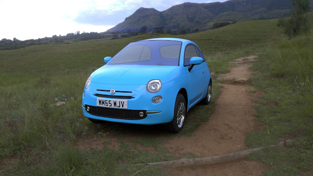
Now, where do I start this week? If I write about everything I did with the scene, we'll still be sitting here a week from now. Hmm... I know, I'll show you the renders first. And if they don't scare you off, I'll babble a bit about modelling, Texture Atlas, and rendering. So, here comes the front view:
and the rear view:
Still with me? Good, let's roll.
If I remember correctly, the Fiat only had its front part complete when I left you last week. Well, mostly complete. My task this week was to do the sides and the rear. So what did I start doing on Monday? Reworking the front bit, of course. I made the logo and the letters on the license plate (I know I could have done it in Krita again, but I thought a few more polygons wouldn't hurt).
Then I decided to add the little extrusion on the hood. Which meant I had to redo the whole part again to create a better topology. I also noticed that the side of the hood is angled differently, so I had to adjust the main body as well. After this I couldn't delay working on the side anymore, so I went in to add the crease. Oh, that crease! I swear that's the most devilish part of design than anyone has ever come up with. It is smooth, but not quite, and it has sharp edges, but not really, and it was driving me nuts. Individual vertex alignment at its best.
That crease naturally triggered several rework sessions on the door, but I was too numb at this point to care. Then the bottom crease knocked on the door (warning: silly puns ahead) and brought Hell 2.0 with it. No, I exaggerate, this one wasn't that bad. But I still wouldn't open the door, if I were you. The real hell broke loose when I started working on the Fiat's rear end.
I thought the blueprints would help. They didn't. So I searched for a couple more reference pictures. Did they help? Nope, only made matters worse, in fact. Because, apparently, no two Fiat 500s are the same, and nothing aligned. It also doesn't help that they spoil the car with a new facelift every year. Anyway, I did what artist do when they don't know exactly how to do something: they take artistic license. The way I interpret the Fiat's rear end is that it has a lots of bumps and a tendency to mushiness. And on a completely unrelated note, I wouldn't open the boot either.
Now, I warned you at the beginning that I was going to talk about the Texture Atlas. It's a wonderful thing and I used it before but it hasn't fully shined until this week. You see, the car is made up of 46 different pieces. I was using provisional materials to better see what I was doing, but I knew I couldn't use that setup in Substance. One, there would be too many texture sets, and two, the UVs would overlap. This is where the Texture Atlas saved me. And made me cleanup and rename everything for several hours... so, yeah.
In the end I came up with a nice system where I prefixed the name of the object with its material, for example "PlasticBlack_LicensePlateTextFront" and I used the same name for the mesh. That doesn't really help anything at this point but it doesn't hurt either. As a side effect of this cleanup I had to separate a lot more things so that each object only had one material. I really hope it won't come back and haunt me in the future. When I had everything renamed, I took all the same-material objects, added them into a newly created atlas group, refreshed the UV unwrap I had done on individual objects before, and I got UV space with nicely separated UV islands. I repeated this process for all 9 materials and I was ready to move to Substance.
In there, it took only five minutes to set everything up. The materials got assigned automatically and I was very happy that I saved so much time. Only I didn't. With the very last material, which grouped several odd pieces, I noticed that the UV islands overlapped. That escalated into two hours of investigation, at the end of which I realised that I had forgotten to delete the individual UV maps that were created before I used the atlas. The atlas disables them, so in Blender everything looks OK, but Substance quietly ignores that and uses both maps (I think).
But I'm rambling again, so I'll quickly close this post by talking about rendering. Or you know what? I'll show you renders from last week and this week side by side, so that you can spot the minor changes more easily. Ready? Here goes.
Not that much has changed, right? It only looks like a different car... I think it's mainly the perspective and the environment that does it, but I still wouldn't expect the differences to be so large. I thought I had the camera set up similarly in Cycles and Iray. Apparently not. But regarding the environment, I'd say the Iray is better, but it still has space for improvement. It's just that setting up the HDR is quite fiddly and you have to adjust several values that influence each other. It's a little bit like a tug of war with a bar of soap...
Anyway, that will be all for this week. Next week, you have a nice shiny interior to look forward to. I have no idea how I'm going to make it based on the available reference images, but I decided to hope for the best. See you next time!
EDIT: now also on Sketchfab
EDIT: now also on Sketchfab


Comments
Post a Comment