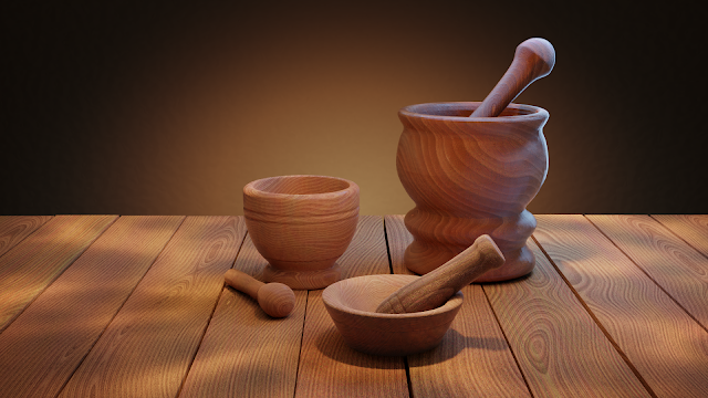
Mortar set
I thought I'd call this "Mortar Kombat", but the little buggers refused to learn kung fu.
And I was also slacking this week, so I only did two projects. The lighting match you see above and "light your car" exercise. For that one I used my old friend Fiat 500. I dressed him up in a new coat and put him inside Eevee (Eh, that sounded wrong. But you know what I mean.)
As I was battling Eevee's not-yet-very-intuitive environment setups, I think I finally started to understand how the light probes work. A little bit. I ended up adding reflection and irradiance probes into the scene and they solved all my weird reflection issues. Which is roughly the extent to which I understand them.
The mortars proved to be a bigger challenge. Which is funny because I wanted them to be a quick and easy project. Just something I put together for the sake of the homework and a weekly project, while I secretly work on my contest submission. So how did it go?
First of all, I made the three mortars. That was a breeze, especially since I remembered that the Screw modifier existed. Then I watched a tutorial on creating a procedural wood material. I was so impressed that I decided to give it a go. Everything went well until the point where I wanted to use the finished material in Eevee. Not sure which part of the node tree it can't digest at this stage, but the result is a super shiny, nearly solid-coloured... thing. And because I really wanted it to look like, you know, wood, I had to switch to Cycles. Hello rendering, my old friend. I did not miss you.
And then the fun began. I struggled a lot to match the model photo, but in the end I just decided to submit what I had. Then I got a couple of critiques. My inner orc woke up and started grumbling—something along the lines of "pfff, I'm not going to work on this any more, I'm tired and there is no point in trying again, I won't get anything better than this, and they don't-". While this was going on, my better part quietly took control of the mouse, pointed it at the Blender icon and dug in again.
Five minutes later I had a version that looked much better (to the great annoyance of my orc friend). This would be a heart-warming story, if my better part also wasn't a perfectionist a**hole. You see, the render you see above is a fricking-version-three. And did I post all the versions in-between and did I have to update the forum posts all the time? Absolutely! Sometimes I think the orc has a point.
Anyway, I'm going to throw a bunch of those versions at you and you can decide which one you like the most. First, the goal and the final-final match.
|
|
And now my first final and the one where I addressed people's comments:
Lighting is fun, don't you think? I do, even though it can also be rather nerve wracking. Oh, and before I leave for the week, I promised in the forum that I'd put together a gif capturing the lighting evolution. So, here it is:
And with that out of the way, I'll take my leave. I have a couple of hours left today so I might be able to squeeze in a bit of work on that contest entry. And I'm not, I repeat, I'm NOT going to watch any more comics compilations today...


Comments
Post a Comment