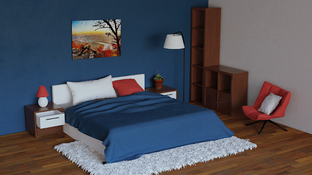
And the bedroom is now lit as well
It was the last week of the class so I decided to go all out and turn in my best work yet.
 |
| Credit: "Mini Project: Bedroom" by Ziyao Chen |
Just kidding. I was really struggling with the interior lighting.
The main issue was to get enough light into the room. You'd think that clever humans designed windows for that specific task and that placing one in a room should be good enough, but there you'd be mistaken. I ended up making a whole window wall and I still had to crank up the HDR strength to 8. The problem is, of course, that I'm also simulating curtains and the light is really hard pressed to get into the room. Even with a portal guidance.
How I'm simulating the curtains, you ask? Well, that's simple enough. Take a plane and give it a new material. Mix a Principled shader with Transparent, and as a factor use any type of procedural noise you like (I know I tried a bunch of them). In the finished material, black parts are opaque and white ones are transparent. Or you can switch them around, if you feel particularly rebellious.
My lighting issues aside, I also stumbled across a camera weirdness. When I uploaded my first version of the exercise, a classmate pointed out that the right side of the room looked off, somehow. And she was right. It turned out that the camera in 2.8 (Cycles) had someone describe perspective to it and then it decided that the concept was too mainstream and it would create her own perspective, with blackjack and weird angles. To fix that, I had to import everything into 2.79, where, suprisingly, the old camera still remembered what right angles were supposed to look like.
With these issues out of the way I only had to spend couple of days creating the materials and tweaking everything to death. I also created the rug hairs, because the original scene uses a texture and I was supposed to come up with my own materials. Not the best rug in the world, but it is serviceable, I think. As to the colour choices, I decided to be bold and imitate those designer bedrooms you sometimes see online. (If you search for them, they typically don't jump on people out of nowhere.) But since I know zip about interior design I created a bedroom that no one would want to sleep in because it would make them feel really bl— Alright, alright, I'm going, you don't have to boo all at once!
 |
| Left: "Catwoman Statue" by Fernando Olivera / Right: 3D scan of a fountain |
And out of the blue (not apologising for this one either) we have the last lighting match exercise of the month. Here I really decided to do something challenging and I'm happy to say that I got exactly what I wanted. I needed to use 13 area lamps, which is a record, as far as I know, but I think I got a decent result. As someone pointed out on the forum, the blue-green light on the left side doesn't really make sense, but since it took so much effort to cram it in there, it was allowed to stay. Plus, if I take it out, the match doesn't look as close to the original, which really beats the purpose of the exercise.
As for the next week, you are finally going to see the outcome of my pumpkin efforts. I'm not quite finished yet, but I think I'll have something to submit after all. See you next time!


Comments
Post a Comment