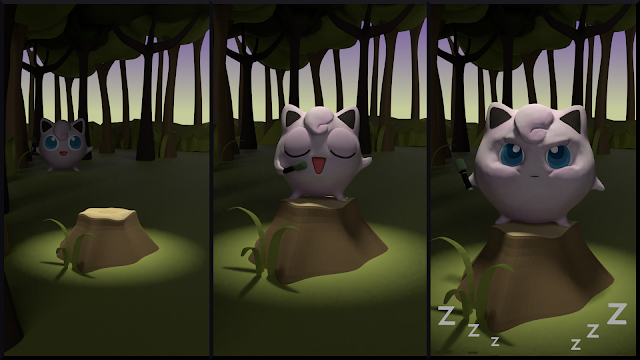
Cute companion (final)
Caudacrispa luminosa.
No, don't worry, I'm not hexing you, that's the name of the creature you are looking at right now. And what a cute little fella she turned up to be. The name translates as "bright curly-tail" but I'd be the first to admit that it sounds much better in Latin. Because Latin is like that.
Now, I want to continue with my latest trend of shorter blog posts (as I'm sure you don't want to read the same things over and over again). This week I'll focus on two areas: using multiple UV maps and post-processing. With an occasional trip to minor adjustments if I find them worth mentioning.

Huh, what's that? Do I hear you say "Multiple UV maps? What kind of sorcery is that?" I'm so glad you asked. Because it is sorcery... of sorts. And one that involved quite a lot of nail-biting before I made it work as I intended. But let's not get ahead of ourselves.
The need arose when I created the feathery material for the wings. (You do NOT want to know how that came to be, believe me. Let's just say it involved an image from Pixabay and a lot of tortured UVs. In several separately unwrapped and layered islands. Ghhh.) When I finally made the wings as little stretched as possible, I faced the problem with alpha-masking. The tips of the wings were black. That's easily fixed by incorporating a Transparent shader into the material, with the alpha channel of the image set as the mixing factor. But. Then you still have the issue of mixing the wings with the body material.
I originally thought that a Mix node would be enough. It wasn't. Then I played with the idea of using a black-and-white image to combine the two materials. But then I remembered I recently came across a tip in which the author used two UV maps to get a similar result to what I was trying to do. And since I'm always on a hunt for better and shinier techniques, I set out to do that.
Only it didn't work. In the "body UV map" I collapsed the wings into a single vertex, and I created another UV map with just the wings unwrapped. Then I set up the two materials, mixed them by using the wings' alpha as the factor... and the body became partially transparent. Even if it had absolutely no reason to. I had to make a bunch of changes before I finally found a working solution.
 |
| Body material, combining the painted texture with wings |
The "full body UV map" has the wings unwrapped, but they are alpha-masked. For some reason, in order to achieve that I had to go to texture painting and use the "Remove alpha" paint brush. Which doesn't make any sense to me but as long as it works... With the alpha on the wings, they started to show as black. I had to combine the alphas of the body and wings, mix the non-alpha channels of both textures, and then use the combined alphas as the factor. I wish you could hear me cheer when it finally worked. It was so loud I might have woken up the neighbours. (I regret nothing.)
The second area I wanted to talk about was post-processing, but before I get to that I wanted to mention I tiny thing that relates to the hair particles. For the longest time I was struggling with the fur in some areas. No matter how many strands and children I used, it still looked patchy. The solution was to increase the value of endpoint roughness in the 'Children' section. As far as I understand it, it fluffs the hair at the end and makes for a smoother look.
 |
| Final (raw) render |
And now, the post-processing. Not too much to talk about, in fact, but it makes a lot of difference in the end. I've been using the filmic color management for a while, so I thought the colour balance was taken care of automatically. It certainly helps, but there are adjustments that need to be made to increase the appeal of the final image.
 |
| Final image with levels adjusted |
I didn't want to overdo it with post-processing, so in the compositor I only used the RGB curves node to slightly adjust the colours. The main trick was performed in GIMP. There is a nice feature called "Levels". I won't pretend to know everything about it, but it shows you the light range of your image. I think the idea is to cover the full range from white to black—so if the graph shows empty space on either or both ends of the spectrum, it is advisable to get rid of it by sliding the handles closer together. The resulting image has more vibrant colours and possibly greater contrast. One thing to look out for, though, is not to restrict it too much—unless you want to end up with an overblown image (and I'm not entirely sure I succeeded in that part).
You can see the post-processing in the gif below. The penultimate image is with RGB curves added, and the last one is with levels adjusted. As usual, do let me know in the comments if you have any tips for me on how to improve my Blender projects, techniques, or blog posts. See you next week with another challenge!


Comments
Post a Comment