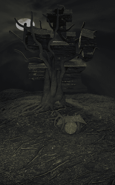
Haunted tree house, part 1
I thought I'd have to think long and hard about what to do this week but then a wonderful opportunity presented itself. I came across the 'Weekly CG Challenge' site that, contrary to its name, does fortnightly art challenges, and awards the winners with particularly nice and useful goodies. I would normally disregard it as something out of my reach, but as I'm getting more advanced as a Blender artist I'm starting to find use for all sorts of high-quality materials and (usually paid) trainings they offer as rewards. I don't expect to be able to win any time soon (the quality of submissions is way higher than my current level) but there is no hurt in participating.
This week's challenge is called 'Haunted house'. When I saw it I thought how unfortunate it was that the first time I decided to participate the topic was so far from my chosen area of expertise. But then something clicked inside my head and a very particular scene appeared. Hmm... I might be able to combine it with nature after all... I don't know whether I'll be able to do the vision any justice but I'm certainly eager to try.
***
The first thing I did was to model a large tree. (Haunted *house*, yes, I know, but stay with me, it gets better.) Conveniently (and scarily) enough, Youtube has recommended just the course I needed. It is a 6-part series run by CG Geek, called 'How to Create a Forest in Blender'. So far I've watched only the first part, but it has already helped me work with the skin modifier so that I could create a half-decent tree. I'm not aiming for complete realism, so the branches are more stylized than what you'd see in nature.
UV unwrapping it was a nightmare, though. (And it would have been much worse if I'd done it properly.) I never know whether I'm doing it right and especially whether the scale is correct. My well-tested approach is "press all the buttons until you think it looks good". I might need to revisit it once I've progressed with the scene a bit. So far I have no idea where I'm going with this.
To "moss up" the roots I used my recently acquired knowledge of combining textures with the help of a mapping black-and-white image. Right now the moss looks too bright but that will change as I work on the lighting setup.
***
However scary a floating tree might be, I have now added a ground for it to stand on. I came across the same issues with scale as before, but my approach worked miracles once again and I think the resulting landscape is rather nice.
 As long as your idea of nice is "drab and bleak". I also reworked the branches a bit and made them more tree-like (narrower at the end and more curvy). I'm still not sure if it's the final shape I'll go for but that will have to wait until I add the wooden structures (spoiler alert).
***
This is the point where the image in my head seemed clearer than it actually was (at least for the purposes of turning it into a graphical image). Once I had the tree, I had no clue how to incorporate the house. I know that there should be several room-sized buildings in the tree top, joined by a series of hanging stairs and whatnot. But how do you actually enter such a house? That's when I came up with the idea of there being another, hidden section of the house that burrows into the hill. Eventually, there should be stairs coming from the center of the hill and winding around the tree.
What made working with the front door quite challenging was microdisplacement. I've come to like it so much that I'm using it on most of the materials in the scene. But the tricky part is placing the meshes—because what you see in the editor is not quite what you get in the render. Things can expand outwards considerably, which means that I spent a lot of time adjusting the meshes. But as a result, the front door area seems to nicely dig into the hill.
One thing I'm not particularly pleased with is the colors. I put the front wall material through an almost black color ramp and it still shines like a beacon. And I can't put my finger on what causes it. I created a sort of "bloody-mossy" overlay for the plank material but when I isolate the node, it doesn't seem to be the culprit. I'll have to dig around a bit more to figure it out.
***
And now the houses. Or house parts. Don't know what to call them. Sheds on branches. Haunted halls of hilarity. Nah. Rooms will do. They are hilariously bad, though. Since I couldn't picture clearly what shape they should be, I just quickly threw couple of extruded cubes together, to get a better idea. Then I thought that giving them texture would improve them (it didn't, really.) Instead, I got stuck on UV unwrapping (I'm starting to cordially dislike that exercise). I eventually gave up on unwrapping it myself and I used the smart UV unwrap. Worked pretty well in this case.
Emboldened by this minor success, I also put together simple roofs—and immediately fell into the same UV hell. Oh well. They are not the most complex roofs in the world but they will hopefully drown in all the little details I'm planning on adding next week.
Oh, and the final image you saw at the beginning? That one also has a moon image added as a background. I spent a little too much time on making it work—it's not a proper HDR, so when I move and scale it, it gets distorted very easily. Even this shape is not perfect (it's skewed horizontally) but it is the best one I could come up with. I had used another image first (you can briefly see it in the gif progression) but then I decided against it. I think the cloudy image creates a more fitting atmosphere. But do correct me in the comments, if you think otherwise.
Next week I'm going to add windows, stairs, all sorts of ornaments and... something special (Hint: I left a lot of free space in the front for a good reason). See you next week!


Comments
Post a Comment